Quick Summary
- Have a plan for your infographic before you begin: Know what story you want to tell and know what data will help you tell that story.
- Clarity is important when making an infographic. Be clear with the title and make your design organized and easy to follow.
- Infographic design should adhere to your brand guidelines, and the text should be complemented with eye-catching graphics.
- Promote your infographics on every promotional channel you have: Email, website, social media, and the local news. They are great advocacy tools!
This is an updated version of a post originally published in 2021.
It’s been four years since we first shared these tips, and I’m so glad we’re revisiting them. The use of infographics remains hugely popular because they’re a fun, engaging way to share your story (and just as fun to build). Whether you’re creating one from scratch or customizing a template in LibraryAware, here are some tips from our team.
1. Start with a plan.
Before you start, gather your stats and data, including any key facts or quotes you want to highlight. Define your main message and outline the story you want to tell. What’s the one thing you want your reader to take away from your infographic?
Some (or all) of these facts and stats can come from your annual report. Read our tips on how to write compelling annual reports, then create infographics to spread the message of your success using work you’ve already done.
Need some help with graphic design? Check out our tips for accidental library graphic designers and get the basics.
2. Have a clear title.
Your title should immediately tell people what your infographic is about. Use a short, catchy title that is easy to understand so that your audience is curious to keep reading.
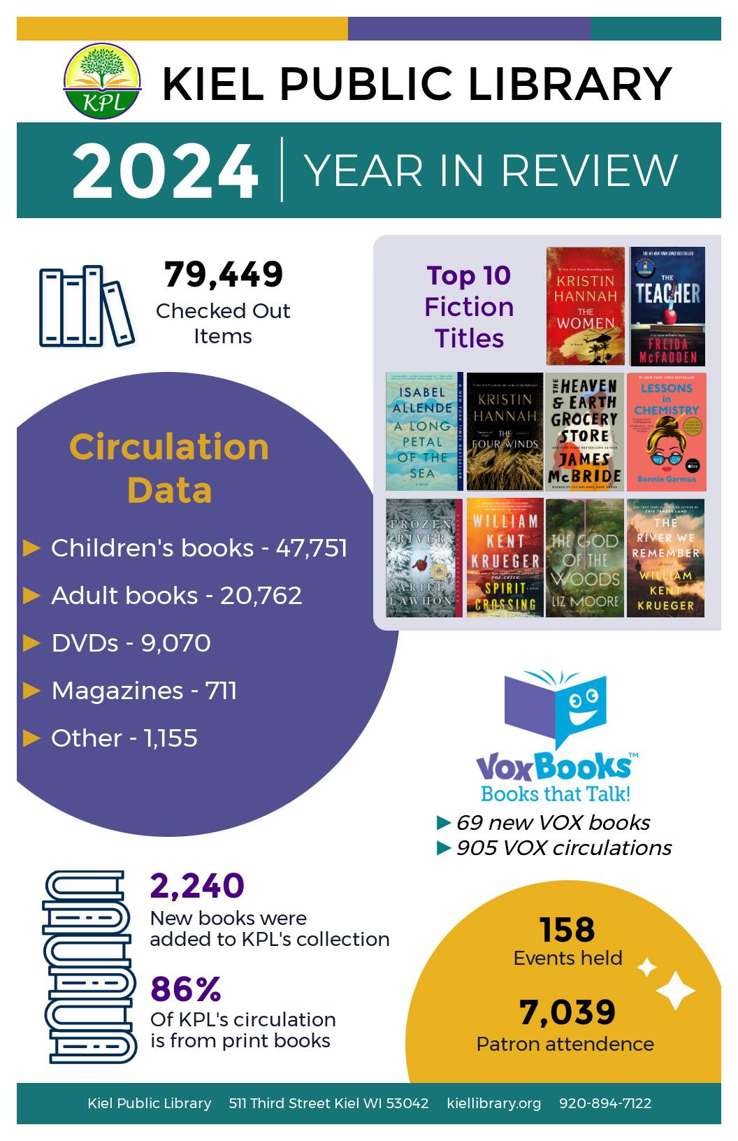
We love this example of the 2024 Year in Review infographic by Kiel Public Library in Wisconsin. They start with a very clear title, and we’re willing to bet they used their annual report as a source of this data.
3. Choose the right fonts.
Stick to two fonts — one for the title and one for the headings and body text. A playful or decorative font for your title can add some interest, but keep your body font clean and simple so it’s easy to read.
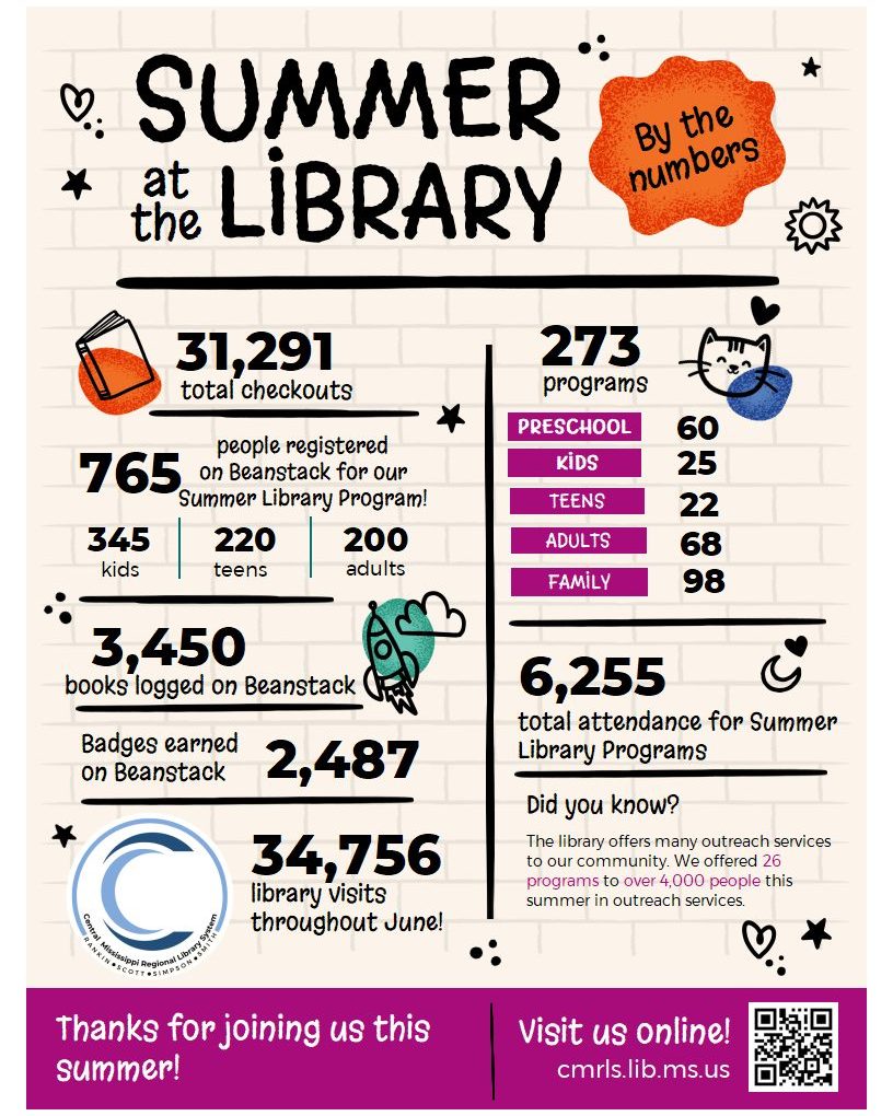
This recap of Central Mississippi Regional Library System's summer reading program in 2025 uses two fonts to great effect. The first font is handwritten and splashy looking (which looks great with the splashy graphics), and the second font is a highly readable sans serif.
4. Choose the right colors.
Use no more than two to four colors that complement each other — this will give your infographic personality without making it look busy. You can use your library’s brand colors or one of the professionally chosen color combinations already set for you in LibraryAware.
Let your topic guide your color scheme: Think bold and cheerful for a kids’ storytime, or subtle and traditional for job-seeker resources.
Remember to always keep accessibility in mind. Make sure there’s enough contrast between the text and background, and use a contrast checker to confirm that your colors are easy for everyone to read.
5. Keep it clean and simple.
Your goal is to communicate a lot of data in an easy-to-understand way. With infographics, less is more. Too much text or too many visuals can overwhelm your reader. Use plenty of white space, rely on graphics instead of long sentences, and let your visuals do most of the talking.
Another way to figure out how to “communicate a lot of data” is to think of your infographic as a story told with a handful of well-chosen graphics and thoughtful snippets. And the infographic doesn’t need to be the library’s whole story — it can be about a program, too. Read our blog on using infographics to tell your library’s summer reading story and learn more about how to make it work.
6. Graphics, graphics, graphics!
When choosing graphics, make sure that they look like they belong together. They should have the same style and colors, so everything ties together, giving the whole design a more appealing and unified look. LibraryAware has thousands of graphics available for your infographic needs. Just search icons and any additional terms, such as specific colors or topics.
7. Create an easy-to-follow layout.
Organize your infographic in the way people naturally read. Start with the most important information at the top, then guide your reader left to right and downward so it’s clear and easy to follow.
8. Use your branding.
Always include your library’s branding so readers know it came from you. You can use LibraryAware’s branding block feature or insert your logo and website URL directly onto the design. Clear branding builds recognition and drives visits to your website, social media, and your library's physical location.
9. Share your infographic everywhere.
After creating your infographic, share it with as many people as possible. Upload it to your website, share it on social media, email it to your subscribers, and even blog about it. Make sure that others can easily share it by providing a link to the infographic itself and including a call to action to encourage your followers to share it with their audiences.
Have you ever wondered if your promotions are working? Sometimes it’s hard to know, right? We’ve identified these three signs that can indicate if your library needs help with promotions.
10. Use your infographic as an advocacy tool.
Does your library have an upcoming ballot measure? Infographics are a great way to tell the story of your library and all of the activity and value it provides for your community. They serve as a succinct yet powerful tool to show all that you do, whether you are sharing with your board, foundation, or voters.
Advocacy is no easy task, and a great infographic might not be enough to make a pivotal difference for your library’s relationship with your community. Read our take on how to lay the groundwork of support in your community and be ready when you need critical support from the important organizations in your area.
Denise Turner is a Senior Graphic Designer for NoveList. She is currently reading Rock Paper Scissors by Alice Feeney.